Migrate Mate
2025
Role
UX Researcher & Product Designer
Responsibilities
End-to-end experience audit and redesign recommendations for an international job search platform
Key Outcomes
• Identified trust barriers preventing user conversions in visa sponsorship
market
• Designed smart onboarding eliminating repetitive setup user flows
• Highlighted trust signals and features through success stories and transparency
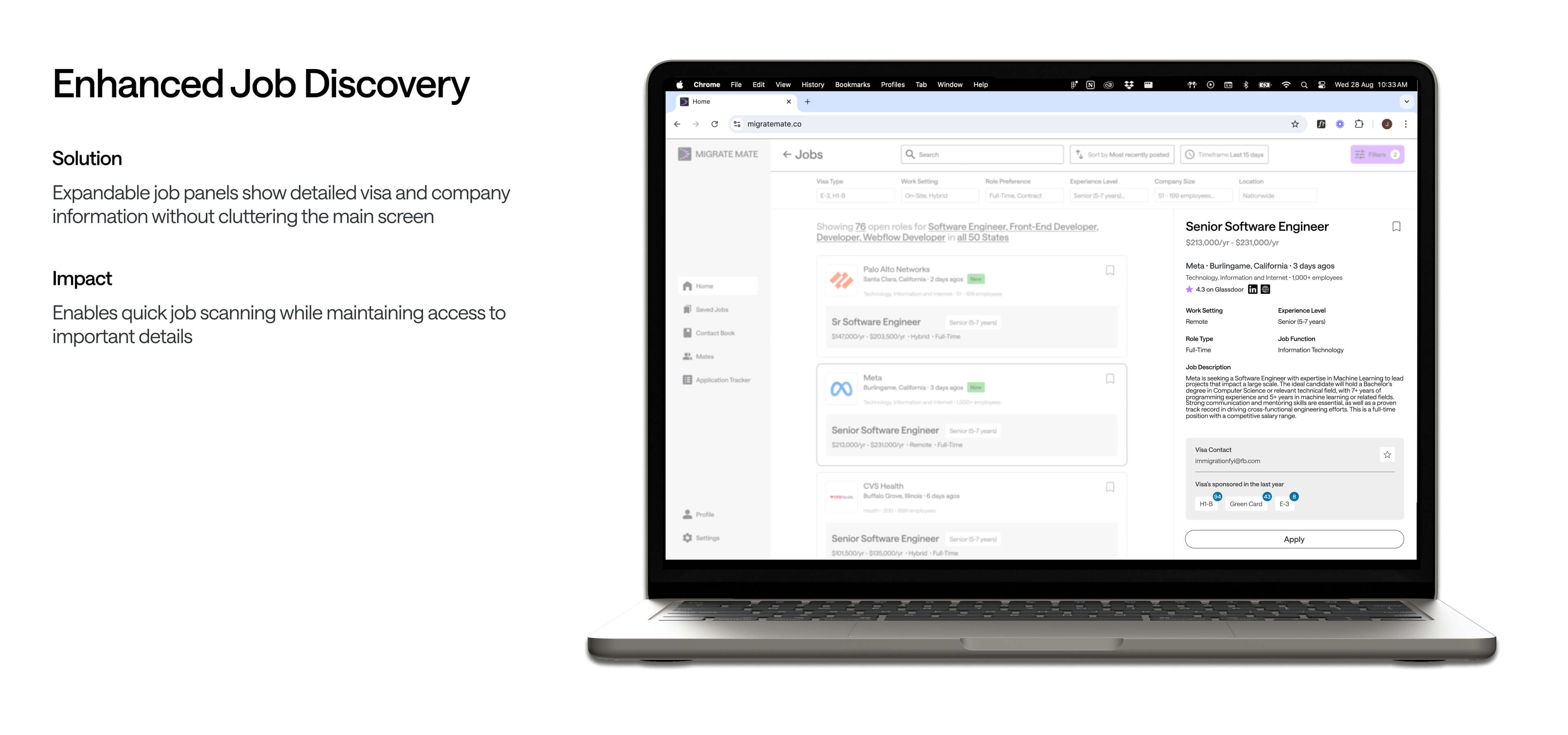
• Streamlined job discovery by reducing information overload
Atelier Marketing Website
Marketing website design extending brand system to digital touchpoint
UX Audit: Building trust and reducing friction for international job seekers
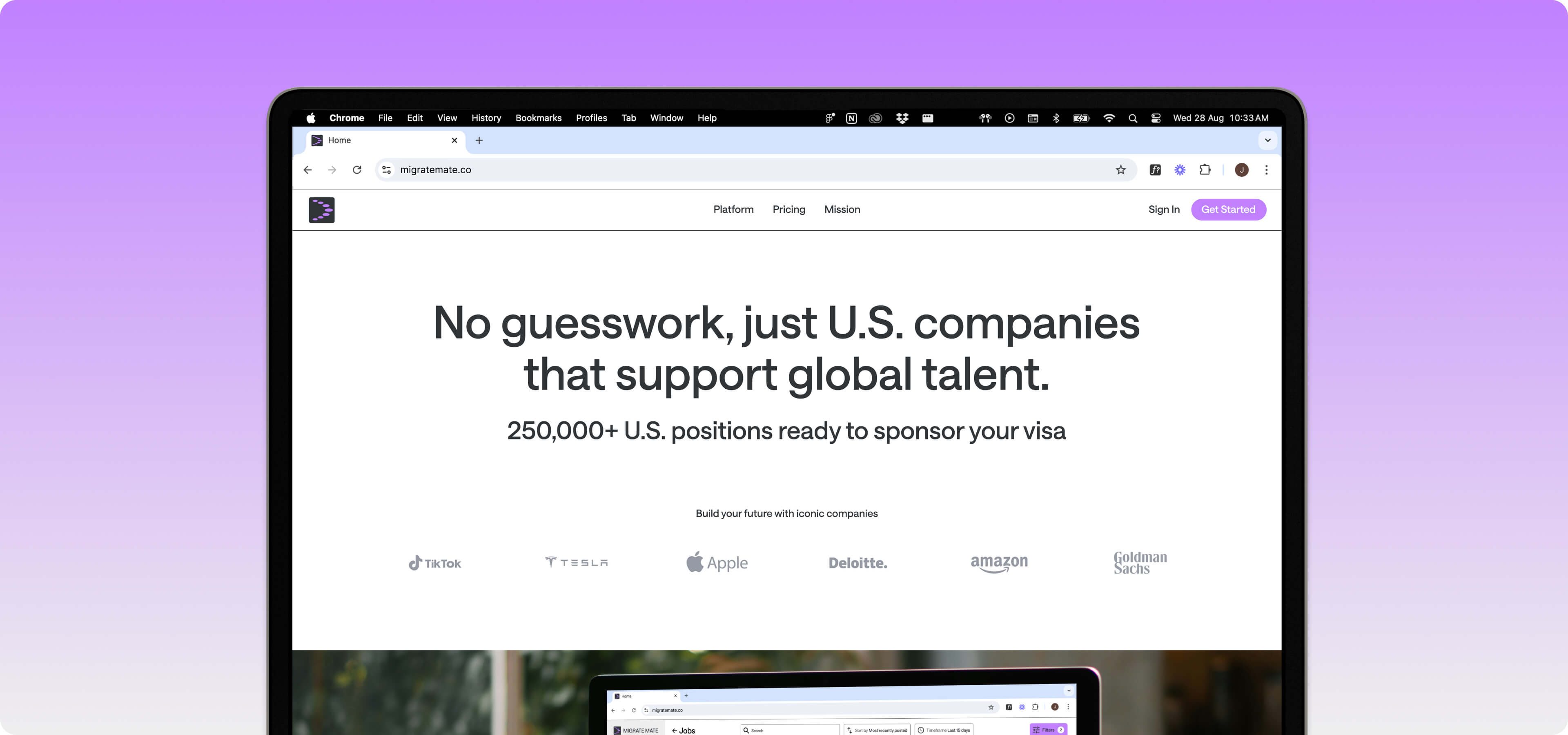
Migrate Mate is redefining the job-hunting and visa sponsorship experience, making it effortless and intuitive. The platform assists international job seekers in finding U.S. employment opportunities with visa sponsorship across H-1B, OPT/CPT, TN, E-3, J-1, and Green Card categories.
*Self-initiated UX audit conducted independently as a research and
strategy exercise. Not affiliated with or endorsed by Migrate Mate
(01)
Project Overview
Conducted a comprehensive UX audit of Migrate Mate's end-to-end user experience to identify conversion barriers and trust issues
Business Context
Rapid growth (10K+ paid users, 300K+ listings, 4.7 CSAT) with an opportunity to optimise conversion and user trust
Project Scope
Comprehensive UX audit of marketing website, product experience, and customer journey touchpoints
Research constraints
Worked without user access or internal analytics - relied on observational analysis and secondary research
My Role
Self-initiated UX audit undertaken independently to practice research methodologies and strategic thinking.
It was an exercise in systematic UX thinking - applying frameworks to understand problems and connect user needs to business outcomes.
(02)
Current State Analysis
Trust and transparency barriers
Users hesitated to pay upfront without seeing product value first, and unclear onboarding left them unsure what they'd actually get for their money
Feature friction reducing efficiency
Frequent users got frustrated by manual, repetitive searches - no saved filters, no job history, just starting from scratch every time
Brand credibility issues
Minimal company details and missing success stories made users question if the platform was legitimate and actually delivered results
.jpg)
(03)
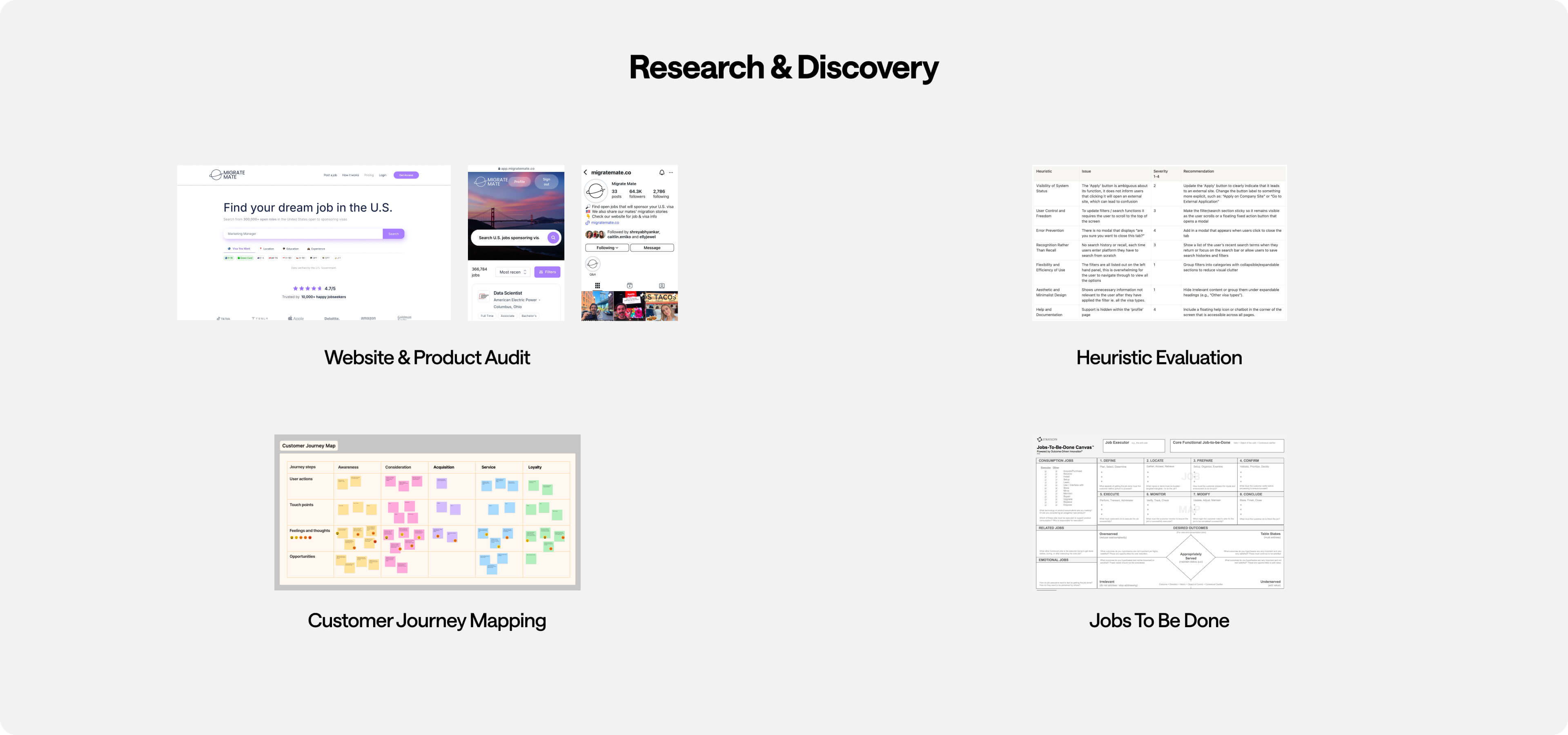
Research Approach & Discovery
1. Independent audit
Conducted end-to-end customer journey analysis from discovery to paid conversion, using observational research methods designed for external assessment without internal data access.
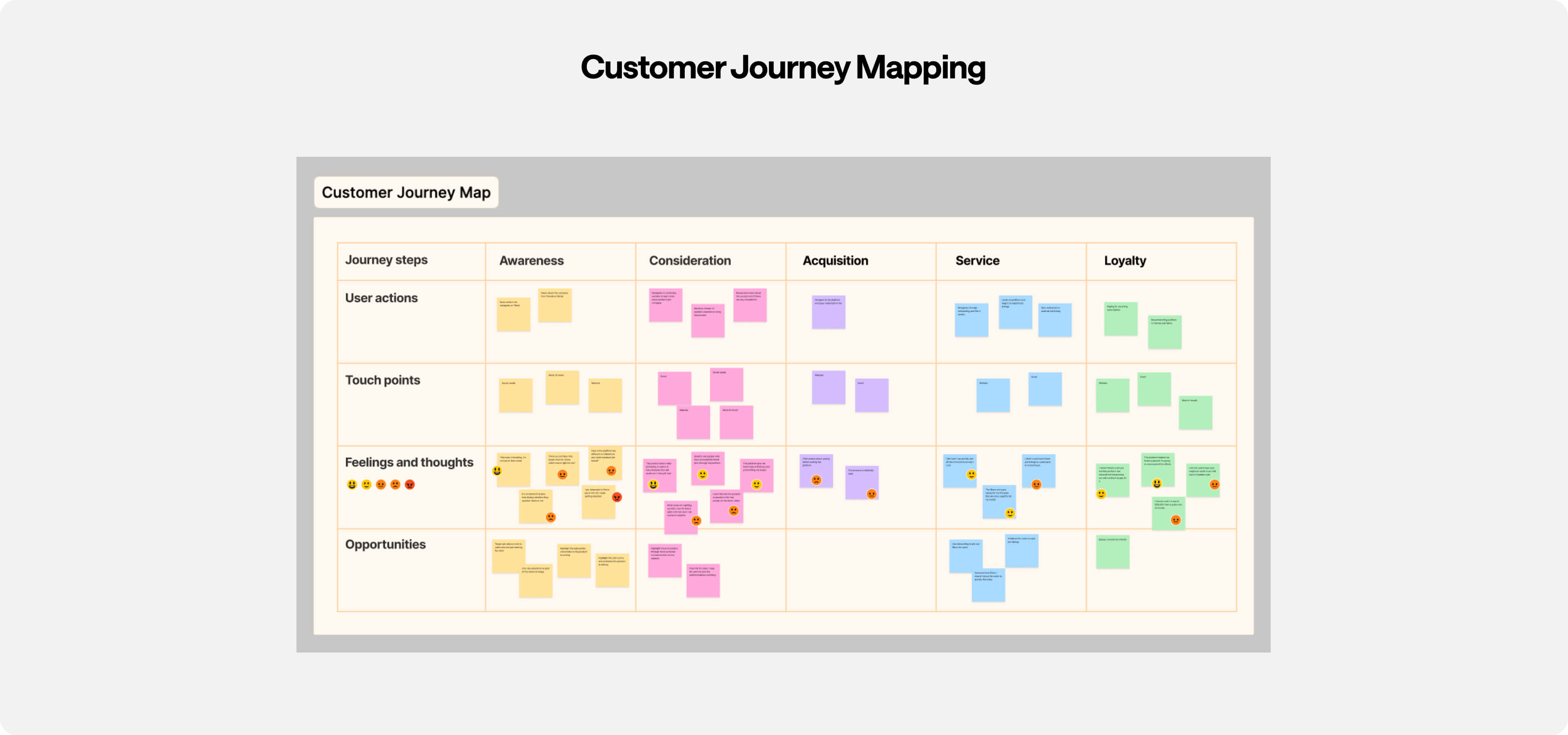
2. Framework and analysis
Applied UX research frameworks (heuristic evaluation, customer journey mapping, and jobs-to-be-done analysis) to identify friction points and map user experience across key touchpoints.
3. Synthesis
Prioritised opportunities where design improvements could directly impact trust, clarity, and conversion, connecting user problems to measurable business outcomes.
(04)
Key Insights & Problem Validation
Focus Area 1: Building Trust Through Brand Strategy
Users hesitated to commit financially due to credibility concerns in a market filled with visa sponsorship scams.
Key Insights
· No visible success stories or proof of real user outcomes
· Missing founder story left users questioning platform legitimacy
· Users needed social proof to build confidence in financial commitment
Validation Methods
Heuristic evaluation, competitive analysis, and user journey mapping
Focus Area 2: Optimising Product Experience & User Retention
Core platform functionality existed but lacked user experience polish needed for daily use and retention.
Key Insights
· Users repeatedly recreated job searches - no saved preferencesNo integrated application tracking - users relied on external spreadsheets
· Users struggled to identify appropriate visa types without expensive consultation
· Limited sorting/filtering made job discovery feel manual and inefficient
Validation Methods
User journey analysis, feature gap analysis, and observational research
(05)
Design Strategy & Approach
Establish credibility and trust through social proof and transparency
Eliminate friction in core user workflows and job discovery
Position platform as comprehensive solution vs. just job board
Success Metrics
· Conversion rates (trust-building)
· Time to conversion (reduced friction)
· Session duration (user engagement)
(06)
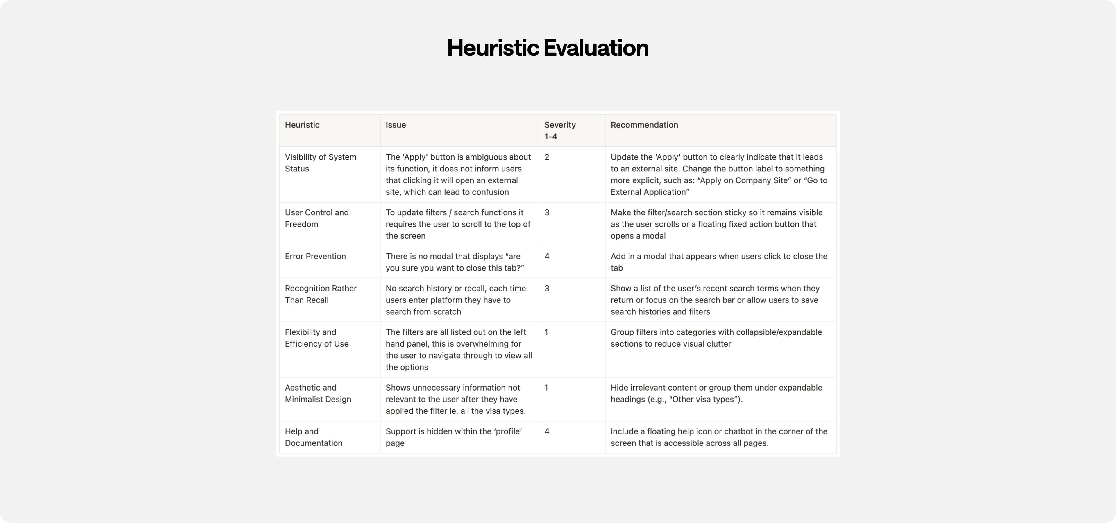
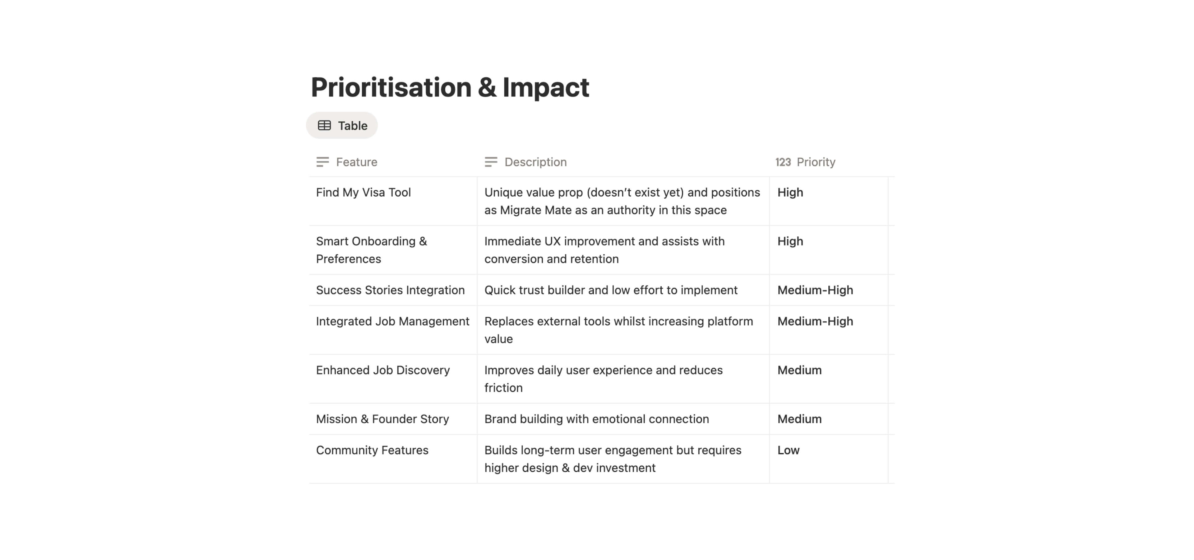
Strategic Recommendations & Solutions
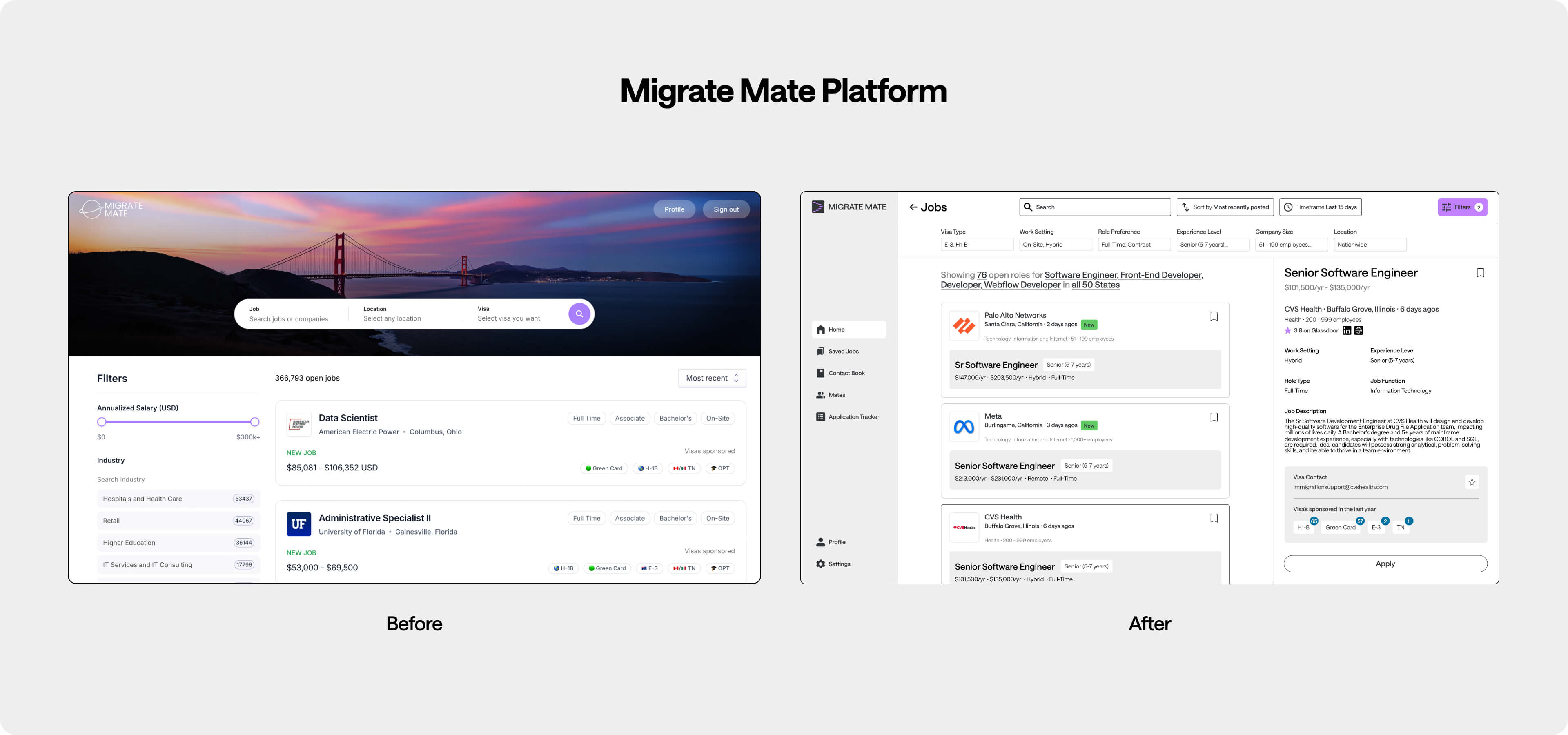
Developed design solutions that addressed both immediate conversion barriers and long-term user retention challenges
Each feature was designed to deliver impact and positioned Migrate Mate as a comprehensive platform rather than just another job board

Atelier Internal Tool
Solving and streamlining an obsolete process by delivering a digital solution
.jpg)

(06)
Learning & Methodology Reflection
Being resourceful without user access
The observational research approach worked well for spotting obvious UX problems and trust issues, but I definitely missed the deeper "why" behind user behaviours. Having actual user interviews would have made my decision-making more concrete.
Seeing the bigger picture matters
This project showed me how problems are systemic across a whole experience. The trust issues wasn't just about missing stories but were also vague company and confusing onboarding. Fixing one feature wouldn't have solved the core issue.
Atelier Marketing Website
Marketing website design extending brand system to digital touchpoint